Arabic text truncation in production: a CSS and QA guide
How to wrap, clamp and ellipsize Arabic and mixed-direction text without breaking names, identifiers or layouts.
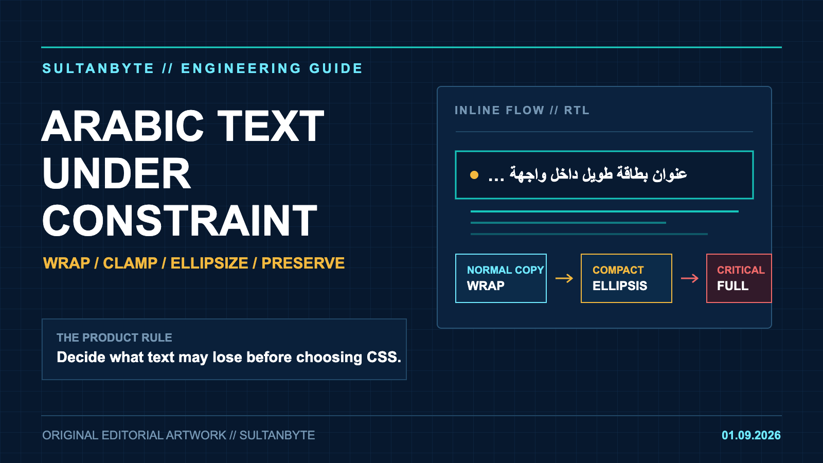
Arabic interfaces tend to fail at the edges: a merchant name that is longer than the design sample, an English product name inside an Arabic sentence, or a transaction reference with no spaces. The quick fix is often text-overflow: ellipsis or word-break: break-all. Both can make the card fit while making the content harder to read or verify.
The safer approach is to decide what the text is allowed to lose before choosing CSS. Body copy should wrap. Untrusted tokens may need an emergency break. Compact labels can be shortened when the complete value remains reachable. Payment references, errors and legal text usually should not be truncated at all.
Cover: SultanByte editorial artwork.
Start with the text's job
A single truncation utility is convenient, but it hides different product decisions behind one class name. Split text into four practical groups:
| Content | Default treatment | Main risk |
|---|---|---|
| Paragraphs and descriptions | Normal wrapping | Broken Arabic joining or awkward line breaks |
| User-generated names and long tokens | Normal wrapping with an emergency break | A token forces the whole layout wider |
| Compact card labels | One-line ellipsis or a short clamp | The omitted text is not recoverable |
| Identifiers, errors and required disclosures | Show the full value, scroll or expand | A user copies or approves the wrong value |
This distinction matters more than any individual property. An ellipsis is a presentation choice, not a content strategy.
Let Arabic wrap as Arabic
The W3C Arabic and Persian Layout Requirements says Arabic text normally wraps between words when it no longer fits. The browser's line-breaking engine combines language, script and Unicode line-break classes to find those opportunities. Keep the defaults intact for normal prose:
.prose {
  white-space: normal;
  word-break: normal;
  overflow-wrap: normal;
  hyphens: manual;
}
Avoid applying word-break: break-all to an Arabic page. CSS Text Level 3 allows that value to create breaks within words and says hyphenation is not applied. In cursive text, that can produce a line break at a place your reader would never choose.
When a field may contain a URL, UUID, tracking code or another unbroken value, scope the emergency rule to that component:
.user-token {
  overflow-wrap: anywhere;
  word-break: normal;
}
The difference is deliberate. overflow-wrap: anywhere creates an arbitrary break only when an otherwise unbreakable sequence would overflow. The specification also requires grapheme clusters to stay together and shaping to behave as if the word had not been split. break-all changes the ordinary breaking behaviour of every word in the element.
Do not inject hyphens or tatweel characters to make a line fit. Arabic justification can use spacing, alternate glyph forms and kashida, but the W3C layout note describes this as a script-sensitive typesetting problem. U+0640 ARABIC TATWEEL is a real character with a predefined width, not a responsive-layout spacer.
Direction decides where the ellipsis goes
Set language and direction in markup before debugging the clipping:
<html lang="ar" dir="rtl">
For a dynamic value whose direction differs from the sentence, isolate it:
<p>
  رقم الطلب:
  <bdi dir="ltr">ORD-2026-AE-884291</bdi>
</p>
The Unicode Bidirectional Algorithm works on logical text and reorders it for display. It also distinguishes isolates from embeddings: text inside an isolate cannot change the ordering outside it, and surrounding text cannot change the ordering inside. That makes <bdi> useful for merchant names, references and other values that arrive at runtime.
For a genuine one-line label, use the complete set of constraints:
.card-title {
  min-inline-size: 0;
  overflow: hidden;
  white-space: nowrap;
  text-overflow: ellipsis;
}
The often-missed line is min-inline-size: 0. A flex or grid child can keep its intrinsic minimum width and refuse to shrink, so the ellipsis rule never gets a chance to work.
text-overflow acts at the inline end of the line. For an RTL block, that edge is on the left. In mixed Arabic, Latin and numeric content, the visual result can be surprising even when it follows the specification. Test the final string in its real direction rather than assuming an ellipsis always belongs on the right.
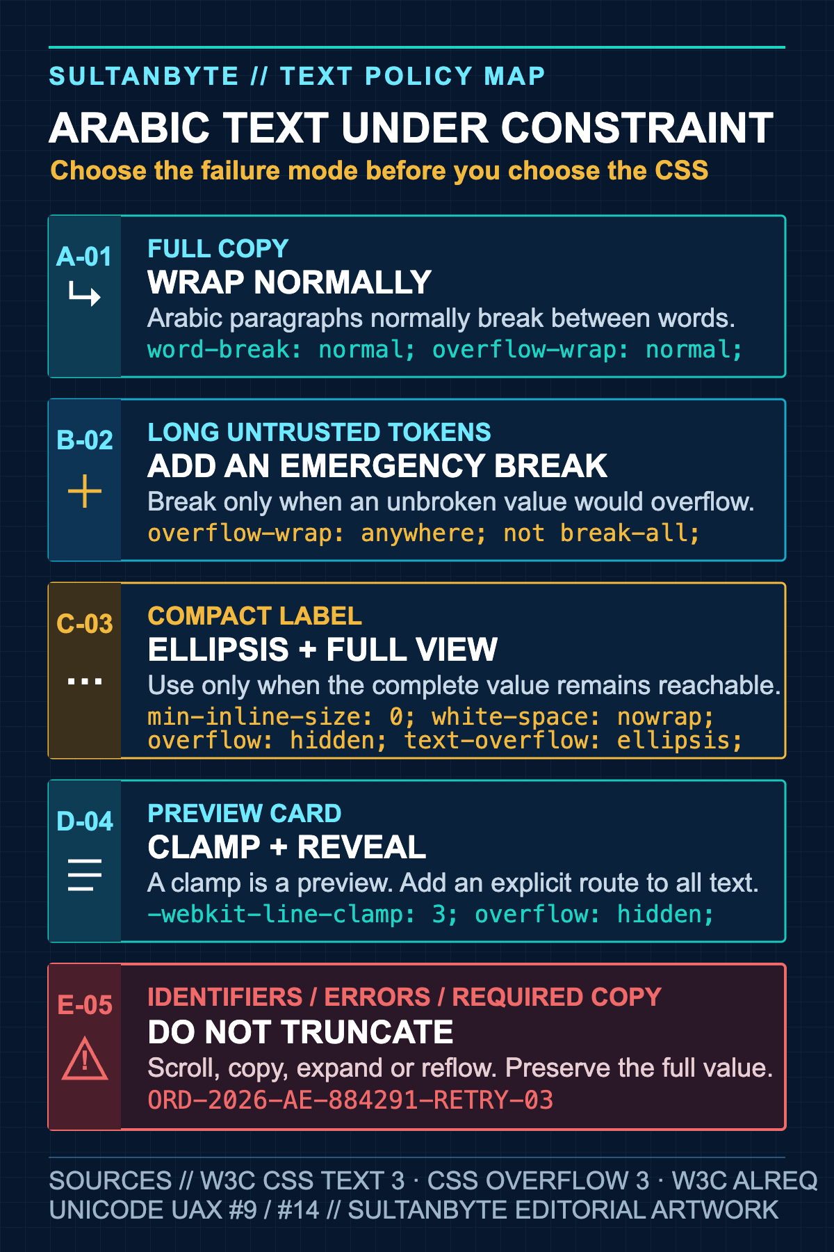
Decision guide for Arabic wrapping and truncation. Sources: W3C CSS Text Level 3, CSS Overflow Level 3, Arabic and Persian Layout Requirements, and Unicode UAX #9 and #14. Visual: SultanByte editorial artwork.
Clamping is a preview, not the full experience
A card excerpt may need two or three lines. The common interoperable pattern still uses the prefixed box model documented by MDN's line-clamp reference:
.card-summary {
  display: -webkit-box;
  -webkit-box-orient: vertical;
  -webkit-line-clamp: 3;
  overflow: hidden;
}
Treat this as a preview. The card should lead to the full article, or provide an explicit expand control. Do not clamp validation messages, consent copy or instructions needed to finish a task. The number of visible Arabic words can vary sharply across fonts and widths, so a three-line English sample tells you little about the Arabic result.
If the product needs an inline expand control, keep the full text in the document and change the visual constraint:
<p id="summary" class="card-summary">...</p>
<button type="button" aria-expanded="false" aria-controls="summary">
  عرض المزيد
</button>
When the user expands the content, remove the clamp class and update aria-expanded. Do not put the missing content only in a title attribute. Touch users and keyboard users need a visible way to reveal it.
Keep critical values complete
Some strings are compact enough to tempt truncation and important enough to make that dangerous. Account numbers, payment references, one-time-password errors and compliance disclosures belong in this group.
For a long machine value, preserve it and offer controlled overflow:
.reference-value {
  direction: ltr;
  unicode-bidi: isolate;
  overflow-x: auto;
  white-space: nowrap;
  max-inline-size: 100%;
}
Pair the display with a copy button that copies the canonical value, not text reconstructed from the screen. If space is tight, show a product-approved masked form plus a clearly available full view. Do not create a middle ellipsis with string slicing unless the owner of that identifier has defined which characters must remain visible.
Error messages need room to reflow. A fixed-height component plus hidden overflow can remove the action the user must take. Allow the block to grow, keep it connected to the field with aria-describedby, and test it at zoomed text sizes.
Build fixtures that expose the failures
A screenshot of one Arabic sentence will not cover the combinations that break production layouts. Put fixtures in component tests and visual regression runs:
export const textFixtures = {
  arabicName: "شركة التقنيات المتقدمة للخدمات اللوجستية",
  mixedMerchant: "متجر Cloud Kitchen فرع دبي",
  orderReference: "ORD-2026-AE-884291-RETRY-03",
  url: "https://example.com/مسار/طويل/بدون-اختصار",
  diacritics: "مُسْتَخْدِم",
  noSpaces: "هذا_نص_طويل_جداً_بدون_مسافات"
};
Run each fixture under dir="rtl" and dir="ltr". Check narrow cards, flex and grid parents, 200% zoom, a 320px viewport and the longest translated action labels. Include Arabic-Indic and Western digits with punctuation because bidi reordering is resolved per line. Unicode UAX #14 defines the default line-break opportunities, while UAX #9 resolves display order after text has been split into lines.
Add a small DOM assertion to catch layout leaks:
const leaks = [...document.querySelectorAll("[data-text-fixture]")]
  .filter((node) => node.scrollWidth > node.clientWidth)
  .map((node) => node.dataset.textFixture);

expect(leaks).toEqual([]);
That check is only a start. A deliberately scrollable reference will overflow by design, and a clipped label can pass the geometry test while hiding essential text. Pair it with assertions about the chosen policy: wrap, ellipsize, clamp with a reveal path, or preserve the full value.
A release rule teams can enforce
Make truncation an explicit component contract. Every constrained text field should name its behaviour and the route to the full content. Then test it with Arabic, mixed-direction text and the narrowest supported layout.
The CSS is the easy part. The production bug usually comes from applying a visually neat failure mode to content that was never allowed to fail that way.
About the author
- I have lead the Engineering for multiple startups in UAE. I also have my own agency qualascend.com.
Comments
Join the discussionI like the distinction between normal wrapping and emergency breaking here. It’s tempting to use word-break: break-all when a long value causes a layout issue, but applying it globally can make Arabic prose much harder to read. Scoping overflow-wrap: anywhere to genuinely unbreakable values seems like a much safer approach.
The point about min-inline-size: 0 is also easy to overlook. In flex or grid layouts, the child’s intrinsic minimum size can prevent the ellipsis from working even when the other properties look correct.
I’d also agree that identifiers and error messages deserve a different policy from card titles. An ellipsis is fine for a preview, but not when the hidden portion could change what a user needs to copy, verify, or act on.
Builder Guides
Practical architecture, engineering, security and implementation guides for teams building technology in MENA.