Arabic dashboards: charts that keep their meaning
A practical review of RTL chart direction, number labels, missing data and accessible alternatives for bilingual SaaS teams.
An Arabic dashboard can show the right numbers and still invite the wrong decision. A reversed time axis, a clipped branch name or a tooltip that only responds to a mouse can make an otherwise accurate report difficult to interpret.
For a product used by operations teams in Saudi Arabia and the UAE, translating the dashboard shell is only part of the job. The chart needs a contract for direction, units, missing observations and access to the underlying values. Switching language should not quietly change the question the chart answers.
This guide proposes a chart-review workflow for bilingual business applications. It focuses on the reporting component rather than general RTL page layout. The recommendations are engineering choices informed by accessibility and internationalisation standards, not a claim of legal compliance in either country.
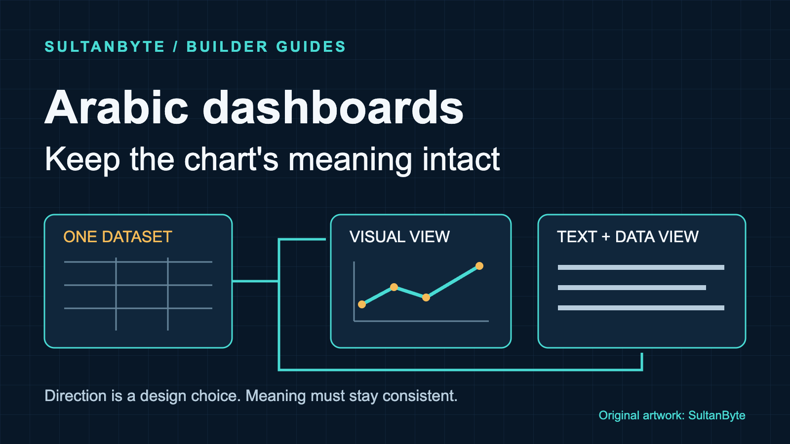
Cover: original SultanByte artwork illustrating one reporting dataset with separate visual and text views.
Keep the analytical meaning outside the translation layer
Start with a chart specification that a product owner can read. Name the metric, unit, reporting period, filters and aggregation rule. State whether the most recent interval is complete. Decide how missing observations differ from a measured zero before selecting a chart library.
Consider a proposed branch-operations dashboard with separate Saudi and UAE views. Both might report completed service requests, but the product must establish whether the inclusion rules and reporting windows match before showing a comparison. Translating two labels into Arabic does not make unlike metrics comparable.
For monetary charts, retain the currency with the value. A combined view of SAR and AED should not silently sum the amounts or label both with an ambiguous currency symbol. Choose separate series or a documented conversion model. SultanByte's money-value guide covers the calculation and integration boundaries; the chart should consume that agreed model rather than invent another one.
Give each series a stable identifier independent of its translated display name. Bind filters, colours, summaries and exports to that identifier. If two translated names happen to match, they must not merge two series. If a label changes, it must not reset a saved comparison.
Localise the text without blindly flipping the plot
W3C's structural RTL guidance recommends declaring an Arabic page's base direction with dir="rtl" on the HTML element and declaring language separately. That is a text and document-layout instruction, not a specification for the chronological meaning of a chart axis.
For this proposed design, choose the time-axis direction explicitly and keep it consistent across the bilingual product unless user research supports a different convention. Label the endpoints and test whether users correctly identify the earlier and later observations. Do not mirror an entire chart with a CSS transform: that also transforms labels and graphical marks instead of reconfiguring the chart's semantics.
Category charts need a separate decision. Preserve a declared ranking when the purpose is to compare largest and smallest values. Use the product's locale-aware ordering when the purpose is to browse names. Neither choice should be an accidental side effect of reversing the source array for RTL layout.
The Unicode Bidirectional Algorithm handles mixed-direction text and directional isolation. Treat a branch label containing Arabic, an English identifier and punctuation as a mixed-text case, not as a string to reverse. Inspect labels in the actual SVG, canvas or HTML renderer your library uses. HTML direction settings alone are not evidence that a canvas renderer handles the same text correctly.
Keep the scope of a tooltip's directional formatting narrow. An English reference code should remain recognisable inside an Arabic explanation. Check copied text as well as the visible result, especially if the code is used to find a record elsewhere.
Format values at the edge
ECMA-402 defines Intl.NumberFormat, including locale resolution, numbering-system options and formatting precision. Use it for labels while retaining numeric values for the scale and calculations.
A count-only label formatter can make the numbering-system choice explicit:
const counts = new Intl.NumberFormat("ar-SA", {
  numberingSystem: "arab",
  maximumFractionDigits: 0,
});

const value = 1200; // Synthetic label fixture, not market data.
const label = counts.format(value);
This example deliberately selects Arabic-Indic digits. It is not a claim that every Saudi user prefers them. Offer the numbering convention your product has agreed with its users, and test the resolved options in supported runtimes. An English-language UAE view and an Arabic-language Saudi view should not be forced through one hard-coded display string.
For a compact axis, abbreviated labels may save space. The exact value should remain available in the detailed view. Keep units visible, and explain rounding where it can hide a meaningful difference. Do not feed the formatted string back into the chart's scale or parse it to generate an export.
Handle missing data before formatting. A missing observation is not zero, and an empty string should not become a zero-length bar through implicit conversion. The product should decide whether a line has a gap and what the accompanying explanation says. Apply that decision consistently to the chart and its data view.
Give readers more than colour and hover
WCAG's use-of-colour guidance says colour cannot be the only visual means of conveying information. For a small line chart, combine direct series names with distinguishable line styles or markers. A legend of coloured squares alone is a weak contract for identifying overlapping series.
Non-text contrast guidance requires at least 3:1 contrast against adjacent colours for graphical parts needed to understand the content, subject to the criterion's exceptions. Review the meaningful marks and boundaries, not every decorative grid line. Ordinary text has separate contrast requirements; the graphical threshold is not a blanket rule for chart labels.
Avoid making the exact value available only when a pointer lands on a narrow line. Provide a keyboard-operable route to the same information and a usable touch interaction. For a dense chart, a filtered data view can be more practical than putting every point in the page's tab sequence.
If you use custom hover or focus content, follow W3C's guidance on dismissibility, hoverability and persistence, including its stated exceptions. A tooltip should not disappear while someone moves onto it, or obstruct the chart with no suitable way to dismiss it. Test the interaction rather than assuming the library's accessibility option covers the complete component.
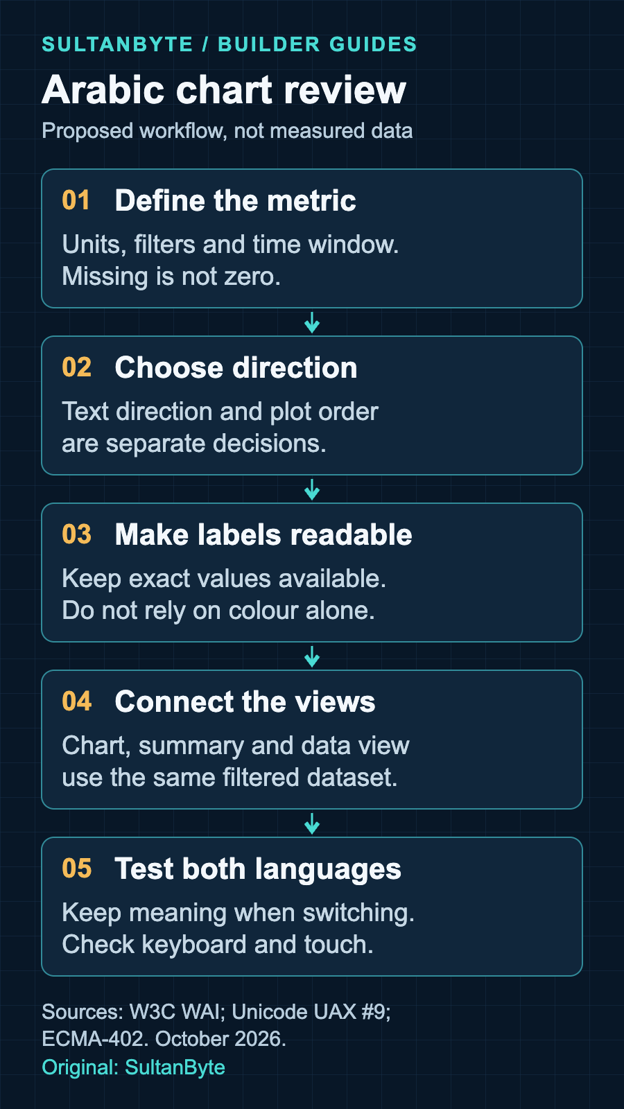
Original infographic: SultanByte. Proposed review workflow informed by W3C WAI, Unicode UAX #9 and ECMA-402, October 2026. It is a design framework, not measured performance data.
Make the data view part of the component
W3C's complex-image tutorial recommends a short description identifying the image and a longer text alternative carrying its essential information. For a chart, that may include values, scales, relationships and the trend the graphic communicates. A title such as “Monthly requests” cannot carry all of that meaning.
Provide a concise visible summary and a nearby route to the detailed values. Generate both from the same filtered dataset as the chart. If a user switches branch or reporting period, the summary and table must update with it. Avoid a manually written summary that keeps describing last month's result after the chart changes.
A table is useful when readers need exact values, but it needs actual table semantics. W3C's tables tutorial explains header and data cells, captions and explicit header associations where needed. A collection of visually aligned divs is not equivalent evidence of those relationships.
Do not squeeze a large table into unreadable phone-sized type. Offer a focused view of the selected series or a clearly usable scroll region, preserving access to the full data. A downloadable file can complement the on-page view, but should not be the only route to understanding the chart.
For exports, retain the metric definition, unit, reporting window and active filters. A screenshot detached from its dashboard can otherwise lose the context that made the comparison valid.
Review one deliberately awkward fixture
Use a small synthetic dataset before connecting production reporting. The following cases are proposed acceptance tests, not measured customer behaviour:
Zero and missing: include a measured zero beside an absent observation. Require different explanations in the chart and data view.
Mixed labels: combine an Arabic branch name, a Latin reference code and parentheses. Check visible order, spoken output and copied text.
Long names: use a realistic long Arabic label. It must remain discoverable without relying on a mouse-only tooltip.
Close values: include values that round to the same compact label. Require the detailed view to preserve the distinction.
Language switch: change language while a filter is active. Require unchanged series identities, values, units and the declared axis policy.
Alternative access: complete the reporting task using a keyboard, touch and a screen reader. Check narrow layouts and enlarged text separately.
Ask reviewers to answer a concrete question: which branch had the highest completed-request count in the selected interval, and was every observation available? That exposes more than a screenshot approval. If the graphic, summary and table suggest different answers, block the component release until the discrepancy is explained.
For buyers evaluating a reporting product, request this demonstration in both supported languages using your own harmless fixture. For engineering teams, keep it as a regression test through chart-library and locale-data upgrades. Start with one important operational chart and make its meaning survive every supported way of reading it before applying the pattern across the dashboard.